August 27, 2011

Pastels on 5th


Several months ago a good friend of mine told me about an art event in my home town called Pastels on 5th. On September 10th, about 2 weeks away, a lovely collection of local artists will get together and turn my town’s 5th street into a sidewalk gallery! Quite literally, actually. We will be using Arist’s Soft Pastels on the sidewalk cement all the way down the street. 

And it’s all to benefit Alternatives to Violence to raise money for the Loveland safehouse. The safehouse will provide a refuge for women and children, crisis intervention, and counseling.  It will be a secure place to stay for families to escape abuse, heal, and rebuild. 

To raise money, businesses and organizations will purchase a sidewalk square and be partnered with a local artist. So far we’ve raised $10,000 and over 50 sponsors! There will be live music and food will also be provided by local bands and restaurants.

I have the honor of being partnered with Faith Church (my home church) to create art on 5th street! This mission is close to my heart and I can’t wait to participate and help raise money. 

 
To read more about Alternatives to Violence and the Safehouse, please visit their website.


I’ll be playing with the Artist’s Soft Pastels on my front walk this week, so I should have a sneek peek for you later! 


August 19, 2011

Back to Beads

 I haven't been able to sit and makes new beads for about a month so it felt great to sit and get started on a new set!
So... lots of new beads are on the way...which reminds me...I have about 25 finished paper bead jewelry pieces I need to photograph for Etsy. Oh my, I'm a little behind! haha

August 15, 2011

Color me Inspired: Book Art!

As an avid reader and writer, (and artist, but you already knew that.) I love to see how other people combine their hobbies. Ingenuity is a huge part of my life and I'm most inspired when I find some truly unique ideas!

Like these book paintings for example! I never would have thought to use a book as a canvas and really love the effect! 

Check out more of his work!


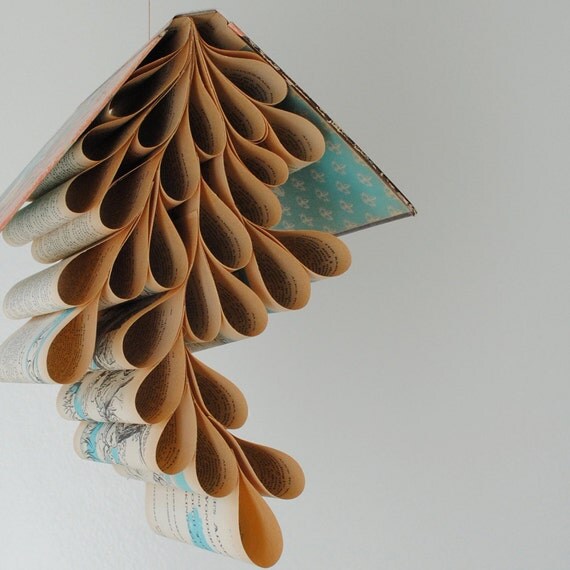
And how about these bookmobiles? Looks like the perfect way to recycle a book that's maybe seen too many days. If I had a library to decorate, this would definitely be in it.

The Shophouse

August 11, 2011

Ambidextrous?

I love challenging myself and giving non-dominant drawing another try was the perfect way to spend my afternoon today!  ((Feel free to click pics to zoom in!))


 Getting the lines right was hardest because my left hand still feels awkward with a pencil in it!


A little further along! Starting to get the hang of it?


Not too shabby? I had a lot of fun with it and will probably keep challenging myself to get better with my left hand. Have you tried it yet?


August 4, 2011

Waiting Room Blues


Blue is one of the most powerful colors. It can convey deep emotion and reminds us of the sky and sea. For me, it makes me feel right at home. My kitchen is decorated in bold cobalt and sometimes, while you're away from home in a waiting room, a little taste of home is just what you need.

Pictured above are a few of my favorites from Etsy!
Twilight Art Print by BestArtStudios2
Art Deco Necklace by boylerpf
Super Sparkler Studs by Mashugana
Dance Troop in Blue by clementseye
Marigold Paper Flowers by DragonflyExpression


Follow my blog with Bloglovin

July 20, 2011

Left Handed?

I remember slow days at the start of the school year when teachers were still pulling together projects for the semester. In my first high school art class, the teacher encouraged us to try drawing with anything other than our dominate hand.

Students started using their feet, toes, mouths, and non-dominate hands to create art! I remember how horrible a simple flower looked and gained a brand new resolve not to use any one else's pencils after that day!


The little heart above is my second attempt at drawing with my left hand (the first being that day in high school) I was honestly surprised I could even get it to look like a heart!

I'm still patiently waiting for my right hand to heal from a little mishap so I can draw again, but the urge to create apparently can't be stopped!

Have you ever tried writing or drawing with your non-dominate hand before? How'd you do?

July 16, 2011

Portfolio Process –Step Two

Now that my portfolio has arrived (And I love it!), it’s time to focus on the art! I wanted to wait until I had the portfolio in my hands so I could measure the actual sleeves. I need to be confident in ordering the right size of prints. It’s nice to know that the measurements given for a portfolio are for the actual size of art you will need, not the outside measurements!

The portfolio I chose has 24 8x10in clear sleeves. Which can be doubled to front and back views to hold a total of 48 pieces of artwork.

Maybe you’re like me and that number, even the 24, is incredibly daunting. Sure, I could fill it with everything I’ve ever drawn… but the concept of a portfolio is to showcase your best work. The crème de la crème, so to say. That can be a tough one from the artist’s point of view. Every piece is special on a personal level. So how to you choose?

  • The first thing I looked at is a piece’s availability to the gallery/shop I hope to contact. If you have the original(especially if well-framed) make sure to include it. 
  • Another great place to start are any pieces that you have available for prints. Not only is this also a plus for the gallery/shop … but if you think it’s good enough to create prints, then it’s good enough to be included in your portfolio.
  • ‘Round out’ your portfolio. Don’t choose works from just your favorite medium. The people you are meeting with want to know what you can do! Make sure your portfolio is as diverse as you are.
  • MOST important? Be you! I was tempted to fill my portfolio with landscapes and still life works. But my love has always been in portraiture. Include what you love, not what you see already in the gallery. Why would they want to see more of the same? Include work that is unique to you.

Now that I have my portfolio and a selection of art (I pictured a few of my considerations up at the top!) It’s time to start hunting for the best price and quality in prints so I can start putting everything together!

July 8, 2011

Portfolio Process - Step one

The most important thing about creating a professional portfolio is having a case that looks professional. Simple, right? I thought so, too. The most helpful tips I’ve found when in search of a great presentation case have actually been common sense!

  • Keep it simple: It’s tempting to go over the top with a case that is bright and patterned but you are trying to showcase the art. You want your audience to remember you and your work, not the case it was in. Black and brown(neutral shades) are the best colors to look for in a clean and simple portfolio. 
  • Go with a firm cover. It will better protect your art and feels more professional in the hands of shop and gallery owners. (Who wants beautiful art flopping around everywhere?)
  • Size matters! So keep it portable and easy to handle. A 8x10in - 9x12in size is perfect.
  • Have a place for business cards, CD’s and notes. That way everything you may need during a meeting will be one place.


Jerry's Artarama
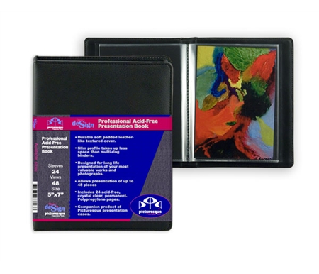
This is the one I chose, Available at www.Jerry’sArtarama.com. After research and going through this checklist, I felt this one was the best bang for my buck to meet my needs. What caught my attention was the easy-to-clean textured cover and the acid-free divider sheets that will act as a backdrop for my art. It also happened to be on sale. ;)
I’ve placed my order and it is estimated to arrive on the 12th!


Remember, if you’ve already been through this process, drop me a line! I’d love to know what you learned and how you feel about your own portfolio!